Tritordeum

What's going on around here

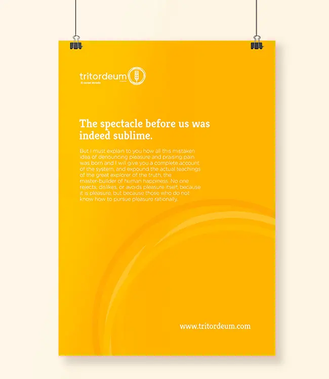
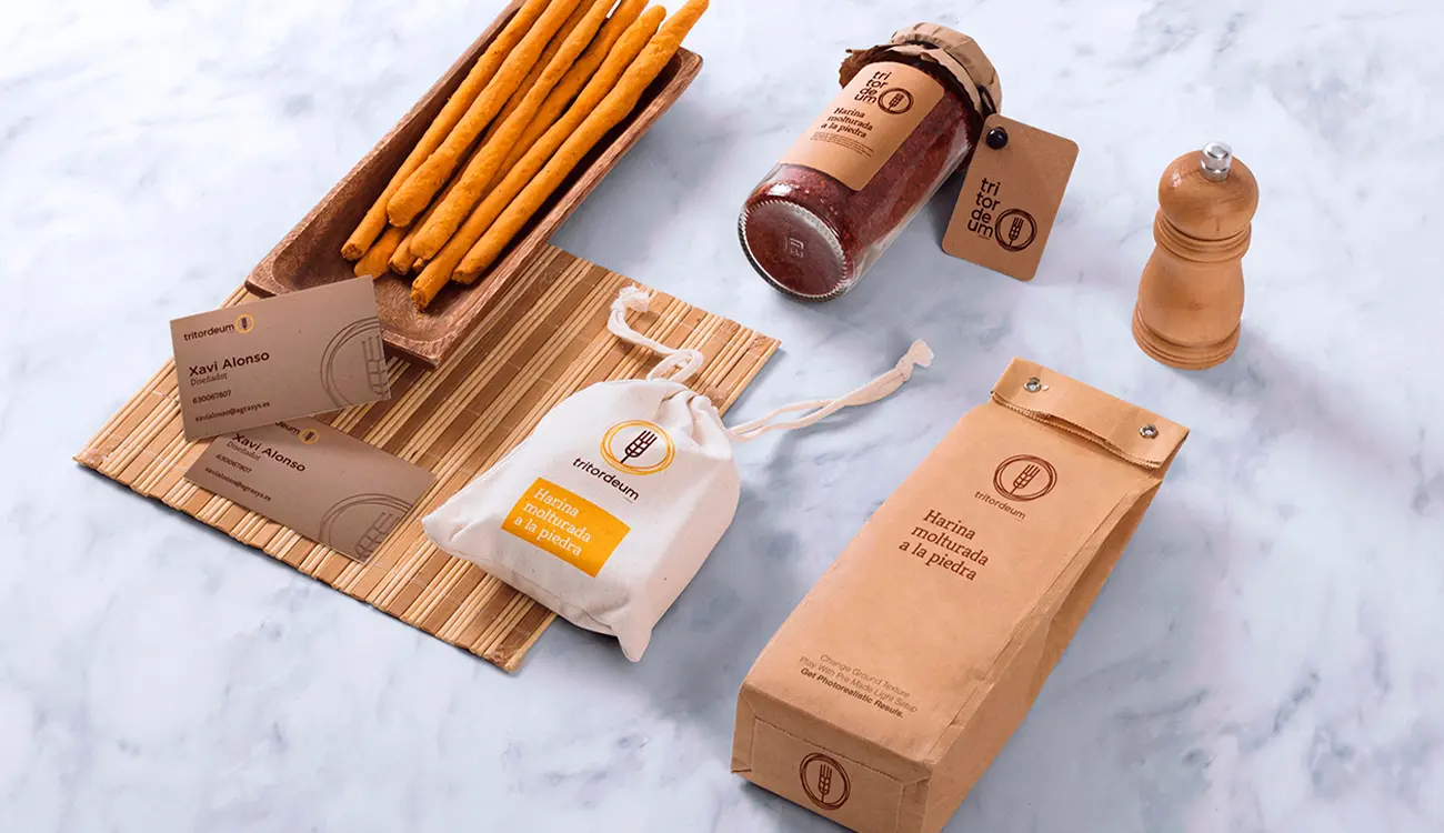
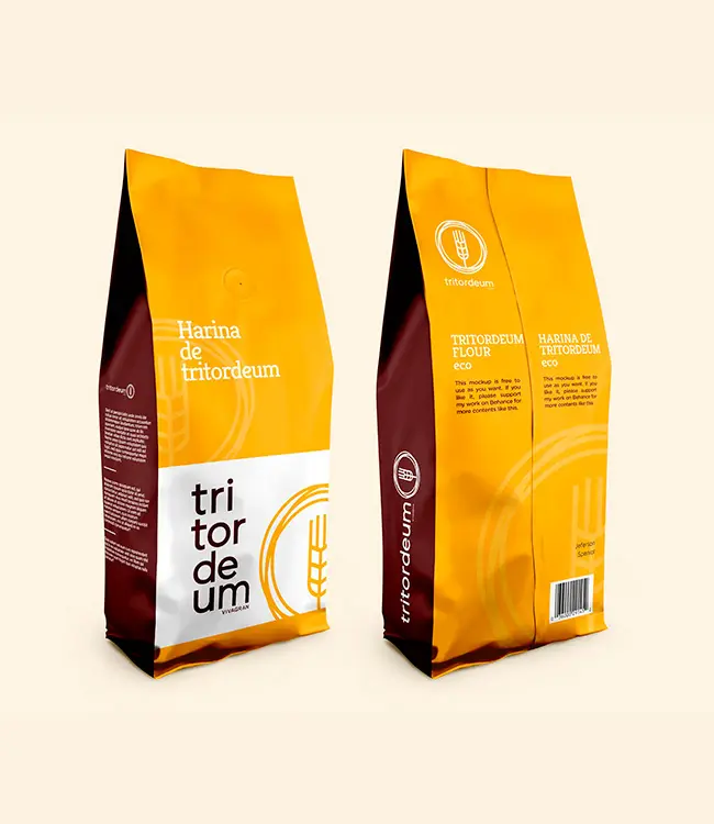
Design and implementation of the new brand identity for Tritordeum cereal, under its slogan THE GOLDEN CEREAL.

For this project, in addition to the logo, colours and fonts linked to the brand, different projects were developed to communicate the new identity, such as brochures, website, videos, graphics for social networks, etc.
Branding
Graphic design
Editorial design
Packaging
Web design and development
Copywriting
Content development
Social Media

Customer

Agrasys

Briefing

This innovative cereal company wanted to maintain its essence in the branding, making the cereal element clear, but fleeing from the already known symbols related to gluten or other elements, and to do it in its own friendly way.

In addition, as «the golden cereal», because of its colour in the field and after baking, I wanted this brightness to be clear in its symbol. For this reason, the logo was made to shine like sunlight.

Finally, the aim was to show modernity and dynamism, as well as versatility.

The golden cereal, and much more

The brand moved from one colour range to another in a short time, but needed to show its new personality within the phrase «the golden cereal», so it looked for colours related to the earth, wheat, bread and the sun, among others.

Applications

This brand was designed to be applied in multiple applications and formats, which is why it was given versatility and the ability to be recognisable in all areas. It is a brand that adapts to the space and can be constructed in different ways as required.